Mental Power
2025
1 month
5× More Registrations from Onboarding Redesign
Project under NDA
This case study is based on my experience working on Mental Power under a NDA. To respect these confidentiality constraints, all information is shared at a high level.
OVERVIEW
PROBLEM AREA
Downloads were high; registrations told a different story
Despite strong initial interest, many first-time users of Mental Power were dropping off during onboarding before completing registration. This suggested that while users were motivated to try the app’s mental wellness offering, friction within the onboarding flow was preventing them from creating an account, even on the free plan.
As a result, onboarding emerged as the most critical experience to redesign when I joined the team.
CHALLENGES & CONSTRAINTS
What we were working with
When I joined Mental Power, it quickly became clear that the onboarding redesign would involve navigating several constraints and challenges.
Designing under uncertainty
Limited onboarding insights made it hard to pinpoint user disengagement, so design decisions relied on UX best practices, research, and strategic judgment.
Communicating complexity with care
The onboarding needed to communicate complex mental wellness concepts clearly while also creating a supportive experience rather than adding pressure.
FIRST STEPS
Why fixing the paywall wasn’t enough
Action was needed quickly.
While it was clear that the onboarding experience required a deeper, more holistic approach, the redesign had to start somewhere. The paywall was selected as the first screen to revisit because it offered the potential for meaningful impact with relatively low implementation effort. It was also a critical decision point in the flow, where users were asked to choose between different paid plans, making it a likely source of friction.
Paywall redesign

Clear, benefit-driven messaging
Jargon-heavy language was replaced with clear and supportive messaging.
Simplified pricing & decision-making
Plans were restructured to allow easy comparison, and a visible primary CTA.
However, this change alone wasn’t enough.
Although the paywall redesign improved clarity at a screen level, it did not significantly change registration outcomes on its own. These results reinforced the hypothesis that the issue extended beyond a single screen and highlighted the need to evaluate the onboarding experience more holistically.
ANALYSIS
So, where were users dropping off?
The paywall redesign showed the issue was bigger than one screen. It was time to zoom out and look at the experience as a whole.
To better understand where friction might be occurring, I reviewed the full onboarding flow and broke it down into its key stages. While I was not responsible for defining the overall order of the flow, my role focused on analyzing each section to identify friction, cognitive overload, and moments of confusion that could impact completion.
Onboarding flow before redesign

Once the full flow was mapped out, it was time to take a closer look at each section.
Connecting the dots
Without clear indicators showing exactly where friction was occurring, I explored additional ways to better understand the challenges that users could be facing during the onboarding.
Before proposing design changes, I evaluated the onboarding experience using UX heuristics as a reference and complemented this analysis with feedback gathered through a user survey. This approach helped me find several critical issues that could be affecting the onboarding completion.
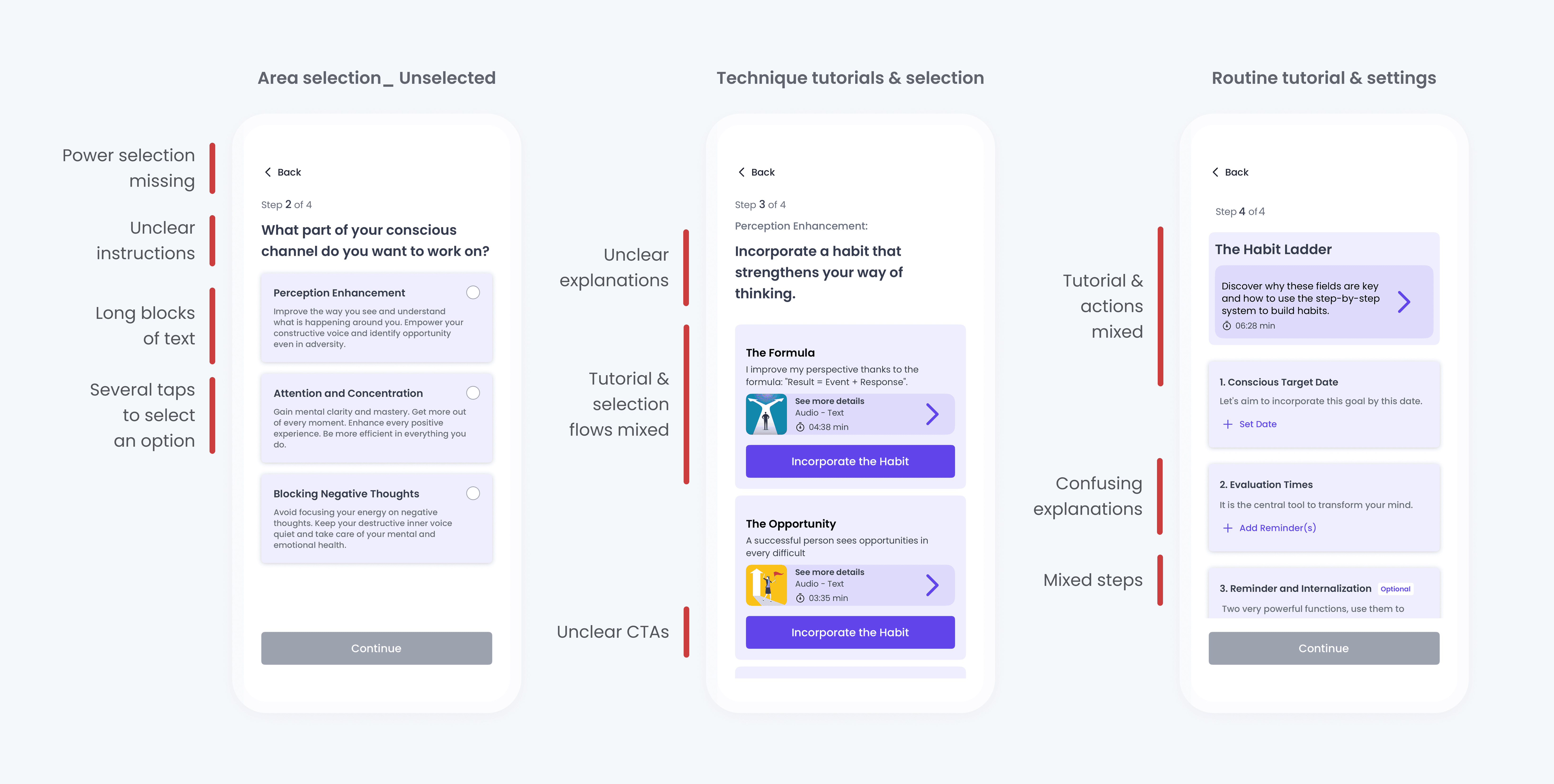
Onboarding screens before redesign

3. High cognitive load
Routine creation introduced a high volume of information across multiple steps, increasing cognitive load.
Feedback from a user survey supported several of the issues identified during the onboarding analysis.
While onboarding length was generally not perceived as a problem, users reported difficulty understanding the app’s core benefits and how it could support them. Although this feedback was memory-based and not statistically significant, it provided valuable insight that guided the redesign.
Before addressing the entire experience, one simple yet critical flow needed immediate attention: the sign-up and sign-in experience.
DECISION 01
Low effort changes for a greater impact during sign-up
At this stage of the redesign, one thing became clear: if users couldn’t create an account easily, nothing else in the onboarding flow would matter.
To address this, I focused on simplifying the sign-up and log-in experience as one of the earliest and most critical moments in onboarding. New users were initially presented with a login-first screen, which could create confusion and unnecessary friction. The goal was to design an account creation experience that felt intuitive for first-time users while still efficiently supporting returning users.
This also represented a quick-win opportunity, as the experience could be improved with minimal development effort.
Sign-up redesign
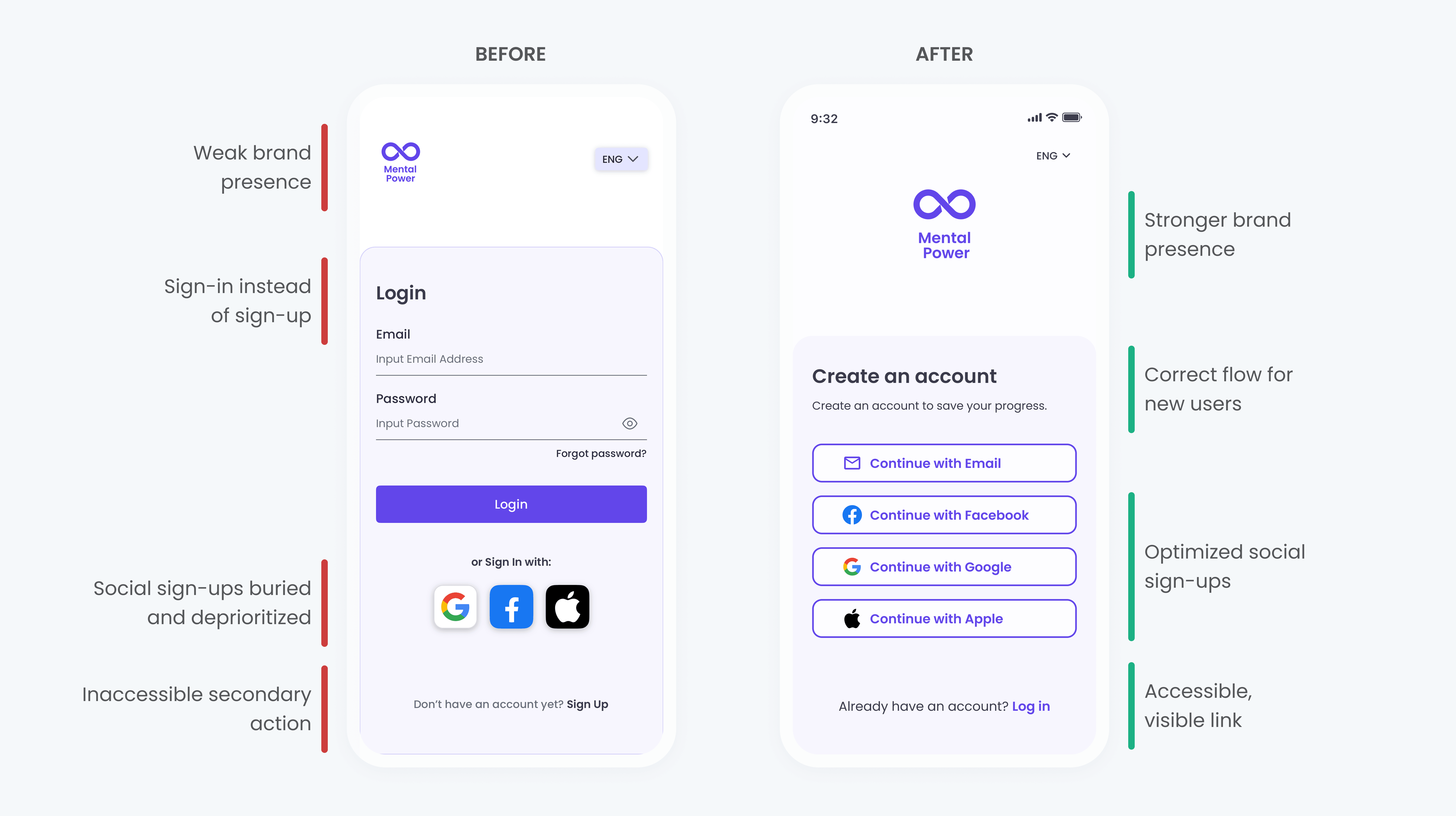
Clarified the primary path for new users
A “Sign in” screen could confuse new users, so the flow was redesigned to prioritize account creation.
Optimized social sign-up to reduce friction
Fast sign-up options (Google, Apple, and Facebook) were prioritized to reduce effort during registration.
Sign-up with email redesign
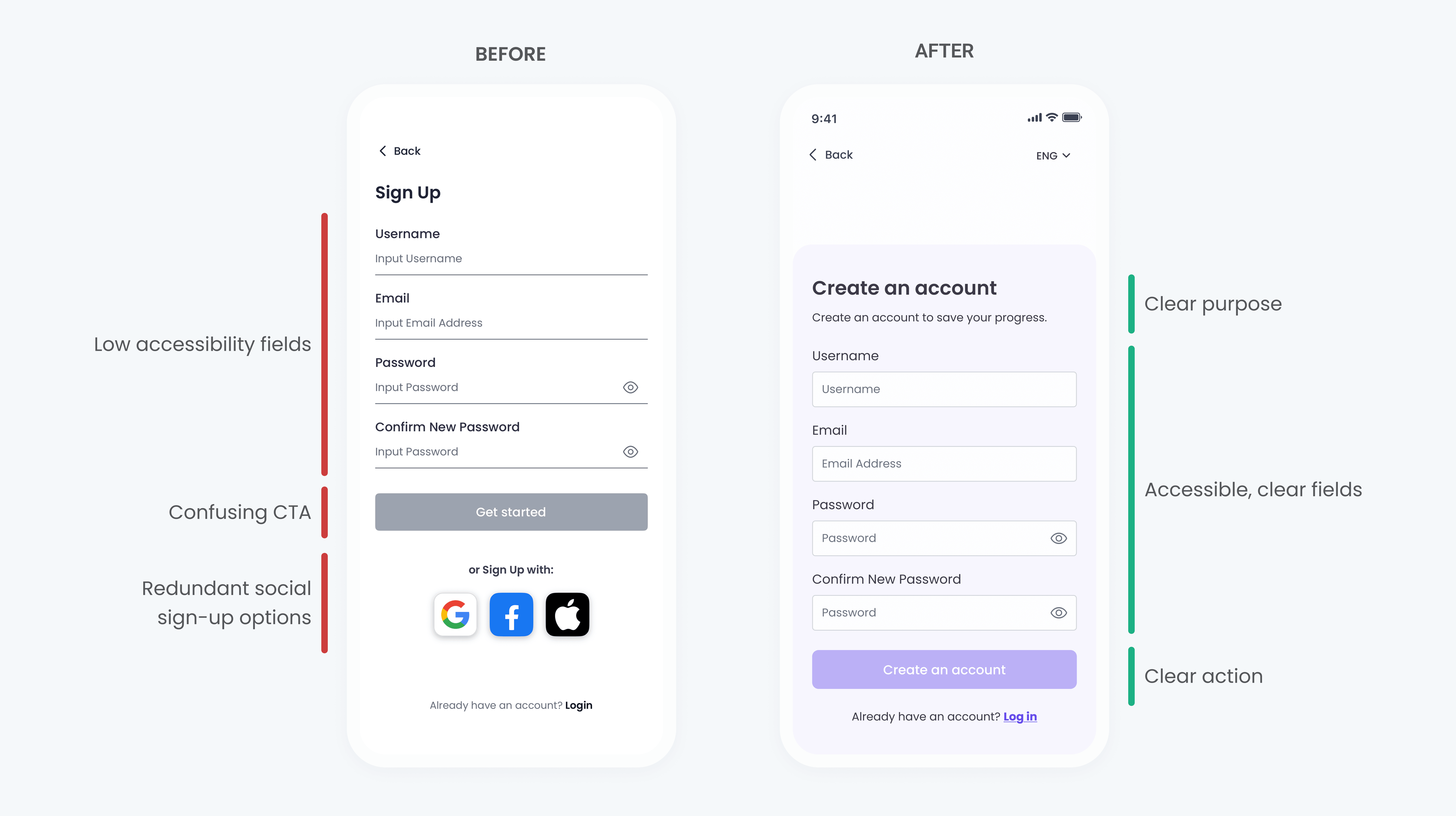
Improved form accessibility and clarity
Underlined text fields were replaced with outlined text fields to create clearer visual boundaries, improve readability, and increase touch accuracy, supporting accessibility and usability best practices.
First screen redesign
Reduced friction for returning users
To avoid frustration for users who already had an account, I proposed adding a quick sign-in option directly on the first screen, allowing returning users to bypass unnecessary steps.
With the most critical but relatively simple flows addressed, the focus could then shift to more complex onboarding challenges.
DECISION 02
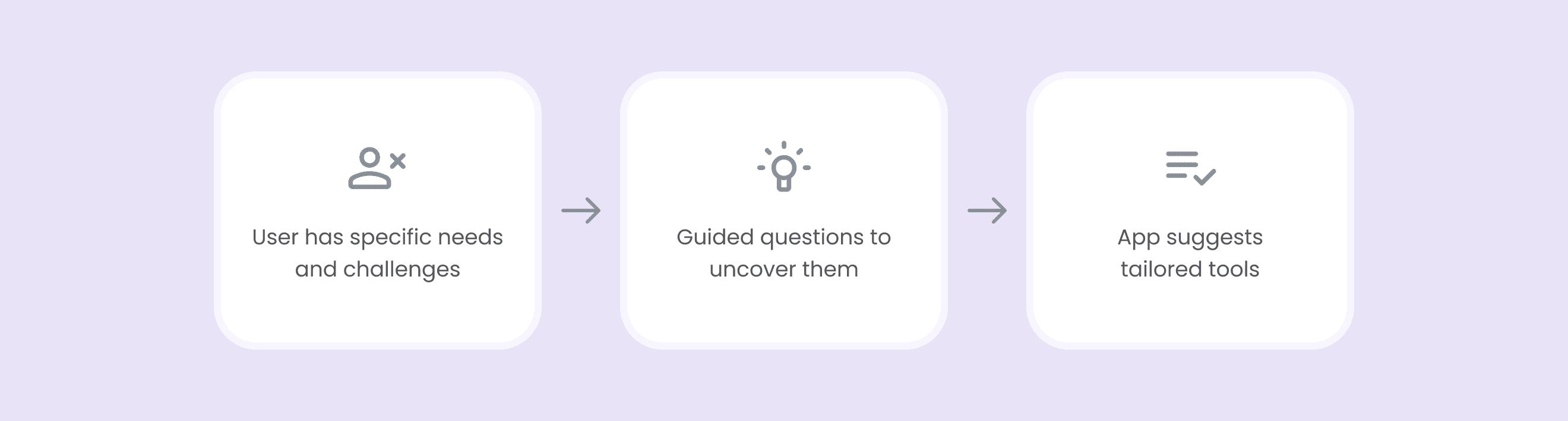
Less explaining & more guiding to create a routine
During onboarding, users were expected to do much of the cognitive work themselves, mapping their personal challenges to the correct tools, when the product could have provided more guidance.
As part of the onboarding analysis, I explored an alternative approach focused on helping users discover the most relevant techniques based on their needs. The existing experience required first-time users to understand internal concepts and decide which “Power” or technique applied to them. This proposal aimed to reduce that effort by starting with the user’s goals and challenges, and then guiding them toward appropriate tools.
Although this concept was not developed further, it helped me reinforce the importance of minimizing cognitive load and providing clearer guidance during the routine creation.
Current approach

Conceptual proposal
DECISION 03
One concept at a time for the routine creation
Routine creation is a core moment in the Mental Power experience, yet it had the potential to overwhelm users during onboarding.
Routine creation allows users to build habits across three levels, or “Powers,” each focused on a different aspect of wellbeing. In the original flow, new users were asked to read long blocks of text while simultaneously making choices, such as selecting a technique or setting a target date.
Routine creation before redesign
Despite these challenges, I intentionally proposed keeping the routine creation as part of the onboarding.
This decision was informed by both user feedback (they didn't find the onboarding too long) and design principles (completing a task during onboarding could create a sense of progress and commitment that could increase engagement).
To improve clarity and reduce mental effort, I redesigned the flow using a “one concept at a time” approach.
Routine creation after redesign
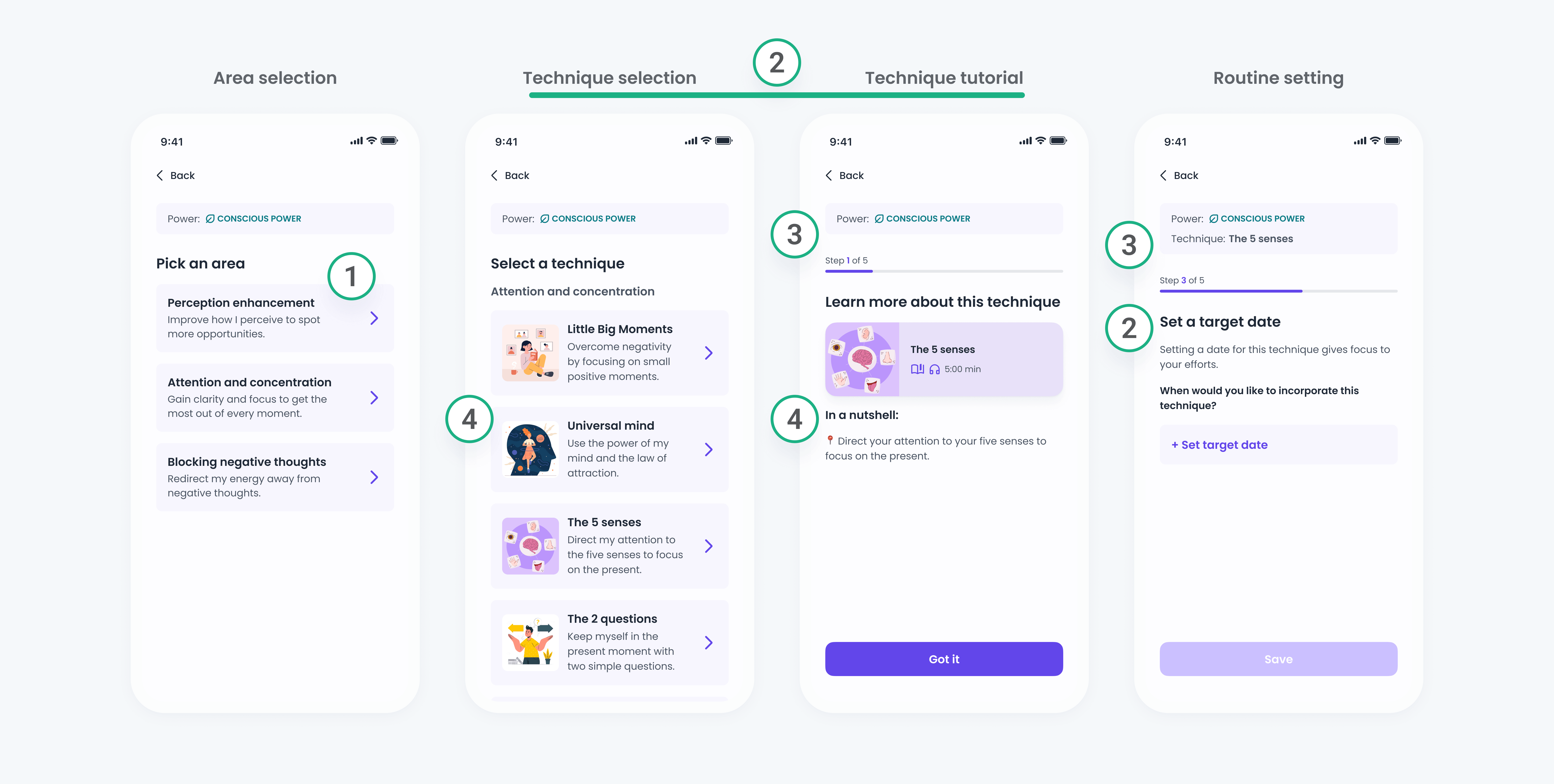
1. Streamlined interactions
Removed unnecessary buttons and enabled progression after each selection, reducing friction.
While simplifying routine creation could help users take action, the onboarding still needed to do a better job of setting expectations and communicating value earlier on.
DECISION 04
A warmer welcome for the first screens
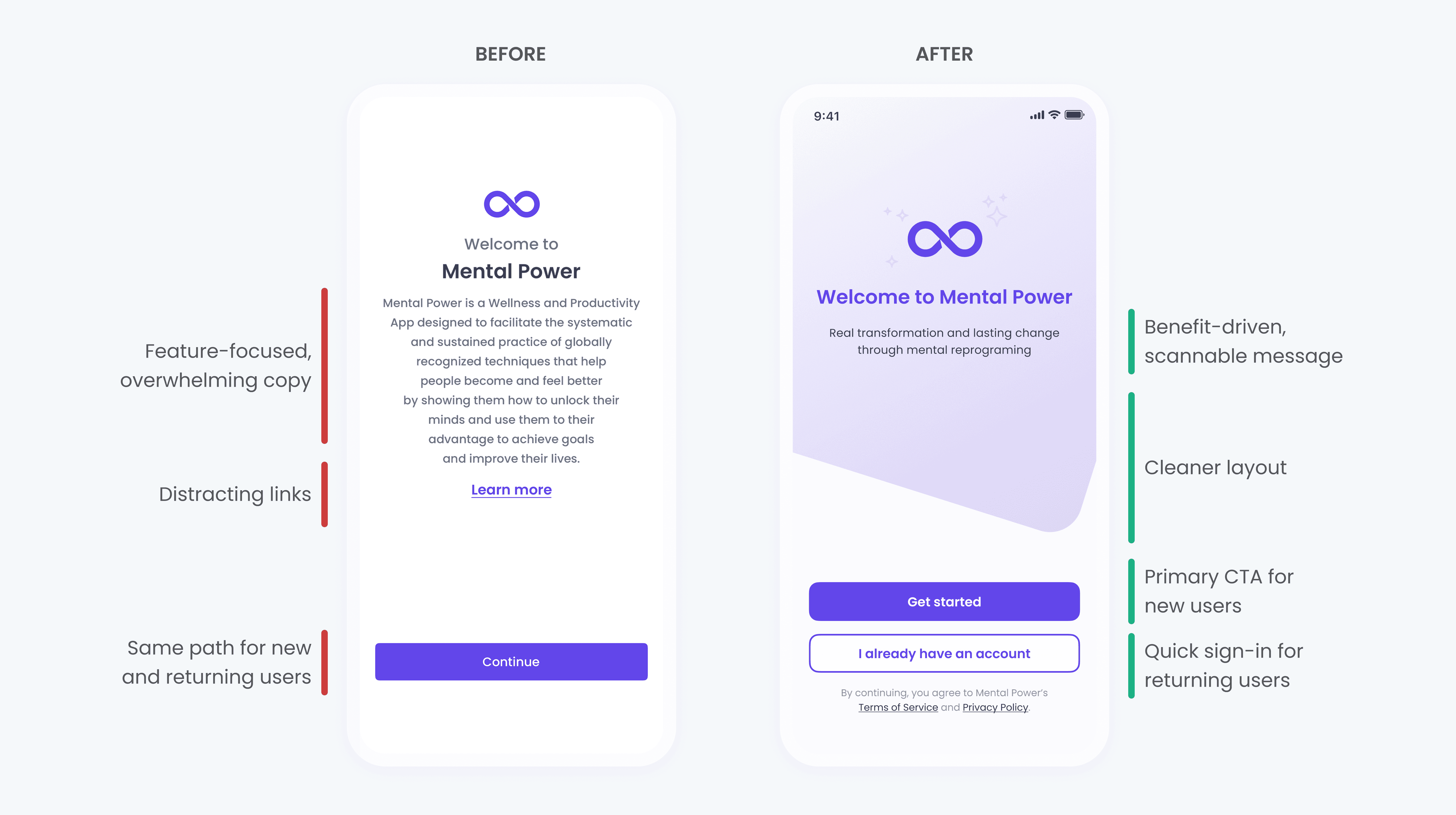
To close the first iteration of the onboarding redesign, I went back to where the experience begins: the first screen and the onboarding carousel.
After assessing and improving the most critical flows, it became clear that the onboarding still needed a better opening. I redesigned the first screens with the same goals of clarity and user-centered thinking, knowing this initial moment would shape how users understood the app and whether they felt confident continuing.
Clarifying the first onboarding screen
BEFORE

Before: Overwhelming unclear message
The first screen relied on dense text, and early explanations of internal concepts, making it hard for users to quickly understand the app’s value.
AFTER

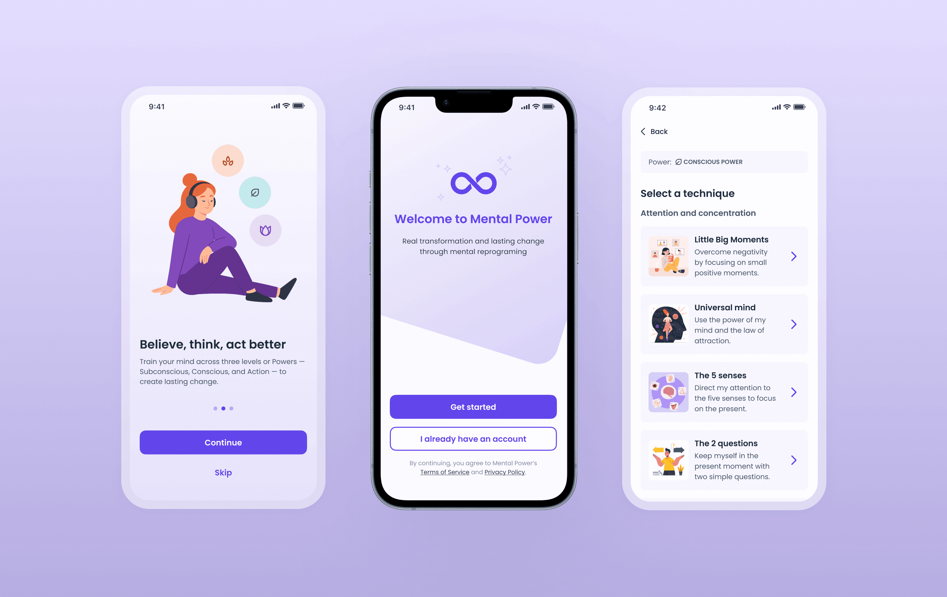
Simplifying the onboarding carousel
BEFORE AND AFTER
After: Clear and reassuring
Messages became benefit-driven, content was structured as one idea per screen, and AI-generated illustrations helped the experience feel more approachable.
Together, these changes created a clearer, more empathetic first interaction that helped motivate users to continue through the rest of the onboarding flow.
RETROSPECTIVE
Let’s talk numbers
Following the onboarding redesign, the experience showed clear improvements:
But that isn’t all
Looking back, the impact of this project went beyond numbers.
Leading the full redesign of Mental Power’s onboarding was an amazing experience, not only because it helped me improve my design skills but because it taught me the importance of close collaboration, strategic prioritization and how optimized workflows can not only save time for the company but improve user engagement.
Looking ahead, potential next steps in my opinion would be introducing more granular onboarding measurement, validating the redesign through usability testing, and experimenting with onboarding variations to further improve activation and trial conversion. In parallel, the UI kit could evolve into a lightweight design system to better support scale and consistency.
“She brings a strong UX mindset, combining research, analysis, and clear reasoning to make thoughtful decisions that truly improve the user experience. Her work on the redesign significantly improved the structure, clarity, and overall quality of the app.”
Hey! You made it to the end

